As someone who works in marketing and web design, landing pages are an exciting subject for me. When it comes to design, I firmly believe in simplicity and clarity, and landing pages should be no different.
Landing pages are typically the entry point to your website for visitors who’ve clicked on a paid listing or display ad. First impressions count, which means that the messaging has to be clear, to the point, and pitched at the right audience segment.
In this blog, I will show you the critical factors that make up a best-practice landing page.
Let’s dive in.
Clear and compelling headlines
You’ve acquired your visitor – well done, that’s the first job ticked off your list. Now it’s time to capture their attention and keep them engaged (in other words, on the page!).
The information in your header should relate to how people found you, i.e. the search term(s) they used. Typically, landing pages are used for PPC campaigns, so the clearer you can be, the better.
The headline is often the first thing users see; it should communicate value and evoke interest. A lot of people discount the value of simplicity. A headline doesn’t have to be overcomplicated – if anything, a complicated headline could cause confusion and increase the bounce rate.
Here’s a great example of a landing page where the headline is clear and focused.
Picture credit: Eleat
Engaging visuals for your landing page
We all know that images speak louder than words, right? So why not shout about your product or service through the power of a strong hero image or even a video?
There’s a lot to be said about the psychology of visuals in website and landing page design. Often, the image grabs the visitor’s attention before the headline, but when used alongside each other, they can be ultra-powerful, improving conversion rates.
Visuals can enhance understanding, evoke emotions, and guide visitors towards the desired action.
Should I use a video or a static image for my hero section?
There’s no right or wrong answer to this question. If you can use video content on your landing page, it’s worthwhile.
We have seen much higher conversion rates with video use on landing pages. Some industry commentators even claim it can increase your conversion rate by up to 80%.
Videos can convey multiple messages in one hit and they’re more personal. If you have the ability to capture simple, effective video content, then I would always recommend using it.
Here’s a great example of a landing page where video content comes in really handy.
Picture credit: Slack
Building trust signals
Trust is really important in digital marketing. There are no salespeople there to help grease the wheels, and it’s much harder to build trust without that personal connection. It’s also a process that’s out of your control, so what can you do to help give your visitors confidence?
Building trust is at the foundation of all this; displaying genuine proof of your claims will help secure more conversions.
There are several different ways to build trust on a landing page.
1. Testimonials and reviews
Testimonials and reviews are a great way to build trust with new visitors. If you can showcase this in a visually engaging way, then you’re on to a real winner.
We almost always recommend video testimonials for this. It’s easy enough for anyone to put together a written testimonial, but with video, you can get across a range of emotions and more personality for an even greater impact.
2. Certifications, awards and badges
Certifications, awards, and business accreditations are proof that you can do what you say you can.
Imagine you are looking for a gas engineer to fix your boiler, and you are torn between two potential suppliers – both landing pages look great and have similar propositions, but one showcases a Gas Safety certification, and the other doesn’t. There is only going to be one winner in this battle!
3. Case studies and success stories
Similar to testimonials and reviews, case studies can help build trust on your landing page. Let’s take the example of an online fitness coach – something becoming more prominent.
In the first instance, visitors are looking for whether or not a coach can get them the desired results. If you can see that the coach is able to get results for their clients, then you’re more likely to enquire.
We did something similar for GB Solar, a client at Marketing Labs. We added ‘recent work’ to the company’s landing pages to help showcase successful projects.
Picture credit: GB Solar
Powerful call to action (CTA)
The CTA on your landing page is all about guiding your visitors to a desired outcome, whether it’s signing up for a newsletter, purchasing a product, or downloading a resource. Its effectiveness lies not just in its visual prominence but also in its clarity.
A compelling call to action should strike a delicate balance between design and direction. Colours and fonts are there to help it stand out, while the phrasing needs to be effective yet concise, clearly conveying the value proposition. A vague or generic CTA can leave visitors unsure, while a well-optimised one can significantly boost conversions, acting as the final nudge in the decision-making process.
Here’s a great example of a best-practice landing page with a simple layout and clear CTAs.
Picture credit: Gousto
Regular A/B tests and continuous improvements
A landing page is never finished. There’s always room for improvement, so keep returning to it to check on how it’s performing and make adjustments where needed.
The power of A/B testing for landing pages can be really helpful, too. It will give you a better understanding of performance, conversion rates and, ultimately, the success of the landing page.
You can even test specific sections of the landing pages if you want to be ultra-granular. Perhaps you think the video walkthrough of your product or service is best placed below the hero image – well, why not test it and create a version with it in the desired place and a version with the video somewhere else? You’ll soon find out which one works for your business.
Don’t settle for your first design. For me, you should always look to improve the journey, the experience and most importantly, your conversion rates! Test, tweak and win!
Elements of an A/B test
There are many different elements on a landing page that you could A/B test, but here’s a list of ideas to get you started.
- Headings: The first thing most visitors read. Test different phrasing, tones, or value propositions.
- Subheadings: Often used to provide additional information and clarify the main headline. You could test different supporting statements or details.
- Images and graphics: Test different image styles (real-life vs. illustrations) or maybe even the positioning of images (left, right, centre, background). Another important one to consider is the type of images you use (product shots, lifestyle images, team photos).
- Call-to-action: Test different button colours, the size of the button itself and even shape. What about the text used inside the CTA button or even the positioning of the CTA on the page?
- Body content: Should the content be short and concise or long and wordy? What about bullet points over paragraphs, and what tone should be used? Play around with all these elements that make up the core information for the landing page.
- Trust signals: Should you try video or written testimonials? What badges are going to add the most value to the page? The placement of logos for partners and clients is also worth checking.
- Contact forms: These forms are crucial for people to get in touch with you. Perhaps you could test the number of fields used in the form, the questions you ask, the type of fields you use (dropdown box, checkboxes, etc.) and even the placement of the form – should it be above the fold, central or at the bottom?
Consider page load speed
Don’t leave your visitors twiddling their thumbs, waiting for your content to load. The longer you keep them waiting, the more likely they are to bounce.
Page load speed is a critical element in determining the success of a landing page. In today’s digital age, users expect swift online interactions. Even a delay of a few seconds can result in lost visitors and potential conversions. Studies have shown that a 1-second delay in page load can decrease conversions by up to 7%.
A speedy landing page is not just a luxury but a necessity. It ensures that users remain engaged, have a positive experience, and are more likely to convert. Moreover, it’s critical to achieving favourable visibility on search engines, especially Google. Optimising for speed can achieve dual objectives: pleasing your visitors and signalling to Google that your page offers a high-quality experience.
You can use Google’s online analysis tool – Page Speed Insights – to test your landing page speed.
Landing page best practice examples
- AirBnB: I think this landing page is awesome. It’s super simple and clean. Its primary message is to engage visitors thinking about hosting their home. It offers great advice, shows the benefits of hosting, and integrates a nifty little calculator to estimate weekly earnings based on location.
Picture credit: AirBnB
- NordVPN: Again, this landing page is really simple. The visitor can clearly see the value they’re likely to get from signing up – a 68% discount on a 2-year deal! It builds trust by comparing other VPN providers and clearly explains when the offer ends with a countdown timer. But the most important element for me is the top section showing me my IP address and protection status.
In one hit, I know how much it will cost me, how long I have to take action on it and why I should be doing it! Good effort, NordVPN.
Picture credit: NordVPN
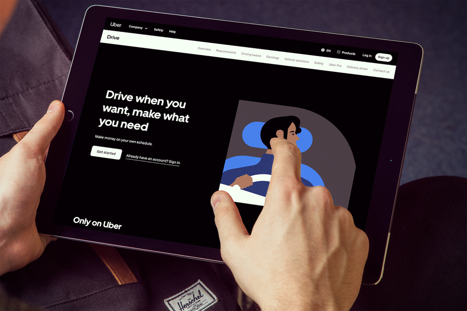
- Uber: Now, if we’re taking simple to the extreme, Uber does this well. They add value by building the proposition of freedom around a job that doesn’t hold you to time or money. The messaging is clean, and the tone is laid back enough to engage the reader. There are also two straightforward CTA buttons for new visitors (sign up) and pre-engaged visitors (log in).
Picture credit: Uber
Landing page best practice: the key takeaway
I started this blog on landing page best practices by saying first impressions count – and if you take one thing away from this blog, let it be that. You’ve secured the click and got yourself a visitor; now you’ve got to convince them to convert!
Simplicity will always win here. Make it easy for your visitors with clear headlines, relevant and engaging visuals, and a compelling call to action. Don’t forget to add those trust signals and pay attention to your page load speed.
Do all this, and you’re well on your way to successfully optimising your landing page.


