Fonts matter when it comes to branding, and your next choice could make a massive difference in how your brand looks, feels and communicates with your target audience. Get it wrong, and it could be ‘Goodnight Vienna’ from the get-go, but get it right, and you’ll be on to a true winner for your brand’s success.
In this blog, I am going to break down some of my findings and opinions on fonts, as well as a breakdown of the different types you might come across, choosing the right sizes and hierarchy, as well as how best to maintain consistency in your brand and some top tips when selecting the font for your brand.
Common font types and what they say about your brand
There are a number of different font types to get your head around. Here are some of the most common types, where you might find them and some examples.
Serif fonts
Think of a serif font as the most traditional typeface choice. It is defined by small strokes or tails on the end of the letters – called ‘serifs’. This type of font is commonly used by brands that are trying to evoke feelings of trust, authority, and in some cases, luxury or heritage. You might also see this font type used quite often in finance, law or property industries.

Sans-serif fonts
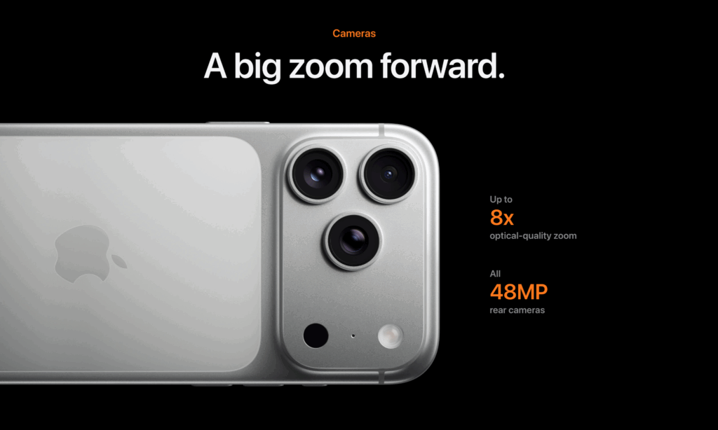
On the other side of the spectrum, you can think of sans-serif fonts as the modern choice for fonts. No strokes or ‘serifs’ as the name suggests, just clean, simple and minimal type that’s perfect for tech companies, lifestyle and digital-first brands. A perfect example of a brand that uses sans-serif fonts at its core (no pun intended) is Apple’s visual identity.

Other sans-serif font examples

Script fonts
Script fonts are fonts styled to mimic handwriting or calligraphy, with flowing and cursive strokes – usually conveying creativity or elegance and used to add personality to a brand. This type of font can commonly be used in the fashion or beauty industry, but could also be used in lifestyle brands too, where a friendly or creative feel is warranted.

Display fonts
Display fonts are decorative, stylised fonts designed to stand out. They are often bold and unique and in some cases, are custom-designed to add extra creativity, flair and impact. Aside from using this type of font in the logo, they’re great for headings, posters and campaign-based marketing assets. Best used in short bursts, as overuse can sometimes overwhelm the overall feel and design.

Monospace fonts
Monospace fonts are unique because every character takes up the exact same amount of horizontal space. Originally developed for typewriters and still heavily used in coding, they convey structure, precision and a technical feel. This makes them popular with brands in the tech and developer space, where clarity and function matter just as much as aesthetics.

Slab serif fonts
Slab serif fonts are a bold offshoot of the classic serif style, characterised by their thick, block-like serifs. They strike a balance between traditional authority and modern strength, making them ideal for brands that want to project confidence and stability. Because of their weight and impact, slab serifs are often used in sports, automotive, and advertising, where a strong visual presence is key.

A quick summary of the font types
When it comes to choosing fonts for your brand, each typeface brings its own personality and purpose. It can be a little overwhelming picking or deciding which font might be best for your brand, but here is a quick breakdown to get you started:
| Font type | What they convey | Best for | Top tip |
| Serif | Tradition, authority, trust, elegance | Law, finance, publishing, luxury | Works especially well in print and editorial designs. |
| Sans serif | Modern, clean, approachable, efficient | Tech, startups, lifestyle, digital-first brands | Great for digital screens; highly readable at small sizes. |
| Script | Creativity, elegance, personal touch | Fashion, beauty, boutique businesses | Use sparingly — best for logos or short headlines, not body text. |
| Display | Boldness, uniqueness, impact | Campaigns, entertainment, youth brands | Ideal for headlines; avoid overuse or it can overwhelm. |
| Monospace | Precision, retro, technical, utilitarian | Tech, coding, data-heavy visuals | Perfect for coding or data; adds a “techy” or retro aesthetic. |
| Slab serif | Strength, boldness, stability, confidence | Sports, automotive, construction, and advertising | Best for logos and headlines; too heavy for long passages of text. |
When the wrong font choice sends the wrong message
Fonts don’t just decorate words; they set the tone for your brand. Choosing the wrong style of font for your brand can completely change how your audience perceives it.
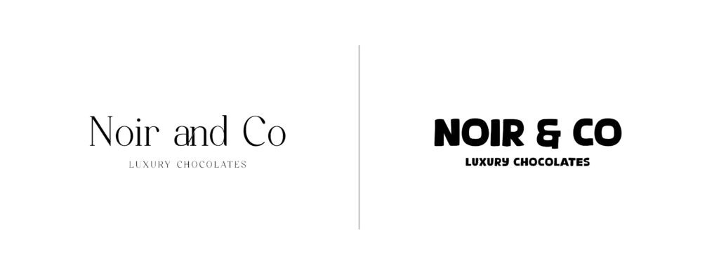
Let’s imagine we’ve been given a brief to create a visual identity for a luxury chocolate brand called Noir & Co. The main goal is to convey indulgence and sophistication. In most cases, I would head straight towards a serif font, as this works perfectly in this scenario due to its refined lines and traditional feel.
Now imagine the same brand using a display font instead. It might not be so bad if the brief was different, but in this case, everything feels a little bit too loud, too friendly and playful, potentially aimed at children. The brand has now lost its sense of refinement and quality, and could risk confusing the audience.

This is why matching your font choice to your brand personality is key. Choosing the right font reinforces this completely, and the wrong one can undermine it in seconds.
Maintaining consistency across your brand
Inconsistent fonts usually dilute your brand message. Using one font on your website, a completely different one on socials, and another in print could confuse your audience. Most strong brands stick to 2-3 fonts and put these into a hierarchy (a primary, secondary and tertiary). Consistency is key here and will help build trust in the brand, as your audience will know exactly what to expect.
Create a brand style guide to help maintain your brand
Creating a brand style guide can really help internal stakeholders and marketing teams understand how to use fonts efficiently and effectively. If you can, create a brand style guide that documents:
- Primary and secondary fonts
- Approved sizes and line spacing
- Colour pairings
- Usage rules (where each font applies: headlines, captions, body, etc.)
Don’t change your font for a while
Consistency is key in building recognition. When customers see the same font across your website, packaging, and marketing, it reinforces trust and makes your brand recognisable.
Switching fonts frequently, on the other hand, can make your business appear unpolished or unsure of its identity. According to a report from Forbes and research from Lucidpress, they found that consistent brand presentation can increase revenue by up to 33%.
Understanding font size and hierarchy
In order for your font to work well digitally, it needs to have a good hierarchy and structure. Headers should draw attention or help users take action, sub-headings should guide, and your body text should be easy to read.
Font sizing
At Marketing Labs, we use maths to determine font sizes (usually because Josh forces it), we usually start with a root font size, and then the headers are scaled up based on a multiplier and calculated rem figures. But I’m not going to get into that now, and I will just walk you through the general rules I think work well for the web.
Body text – The general rule for body text is around 16-18px to allow for both accessibility and readability.
Headings – Should clearly be larger than the body, typically 2-4x larger than the body.
Line spacing (leading) – 1.4 – 1.6x the body is usually recommended for smooth readability. Too crammed and it’ll make it difficult to read.
Design for mobile first
Always test your fonts on small screens – a font that looks fine on a desktop may be too cramped or too hard to read on mobile. More than half of web traffic now comes from mobile devices, so your typography needs to remain clear and legible on smaller screens. A good rule of thumb is to set body text at 16px or larger, as anything smaller can strain the eyes on handheld devices.
My top tips for choosing fonts that work
Selecting the right font isn’t just about what looks nice – it’s about aligning your brand identity with your audience across all touch points. Here are my practical tips to guide you:
Match your brand personality – Your font scheme should be a natural extension of your brand voice. For example, a playful children’s toy brand might lean into bold, rounded sans-serif to make it feel fun and approachable. Whereas a corporate law firm would need authority and credibility, so choosing a traditional serif font should work well here.
Limit your font families – Using too many fonts in one visual identity can sometimes cause a little bit of chaos and confusion. If possible, try to stick with 2 or 3 typefaces at most and structure them as primary, secondary, and tertiary. This balance will give you flexibility without sacrificing cohesion.
Test across multiple media – A font that looks perfect on your website might not necessarily translate well on packaging, business cards or other printed materials. Try to preview your fonts in the contexts where they’ll actually appear to ensure they maintain the right tone and readability.
Prioritise readability – It can be tempting to choose a decorative font for impact, but if people struggle to read it, the effect is lost. Script fonts, for example, may work really well in a logo, but are really impractical for body text. Clarity comes first here, particularly for longer strands of copy, menus or mobiles.
Check the licensing – Not all fonts are free for commercial use. Google fonts offer a wide selection of open-source options, but a lot of premium fonts require licensing. Cutting corners here can expose your brand to legal issues, so make sure you double-check that you’ve got the right license for your font before commercialising it.
Think about accessibility – Fonts play a massive role in making your content accessible to users. Try to avoid really thin font weights that vanish against lighter colours or white backgrounds, and make sure you’ve got good contrast too.
Font websites
Here are some of my favourite websites to find fonts:
MyFonts – One of the largest font marketplaces in the world, offering professional fonts for any project and over 30,000 fonts to choose from.
Creative Market – Buy and download unique fonts designed by top foundries worldwide.
Envato – Envato’s value-packed subscription boasts the broadest range of creative asset categories, across fonts, photos, videos, templates, 3D and many more, all accessible with unlimited downloads.


